Avios
UK market site transformation
During my 3 years at Avios as a UX/UI Designer, I worked closely with the optimisation and content teams to transform their tired and dated digital platforms – in particular the UK market site used by 10,000+ members.
- Ingredients:
- Product design
- Prototyping
- Usability testing
- Optimisation
Personalised homepage
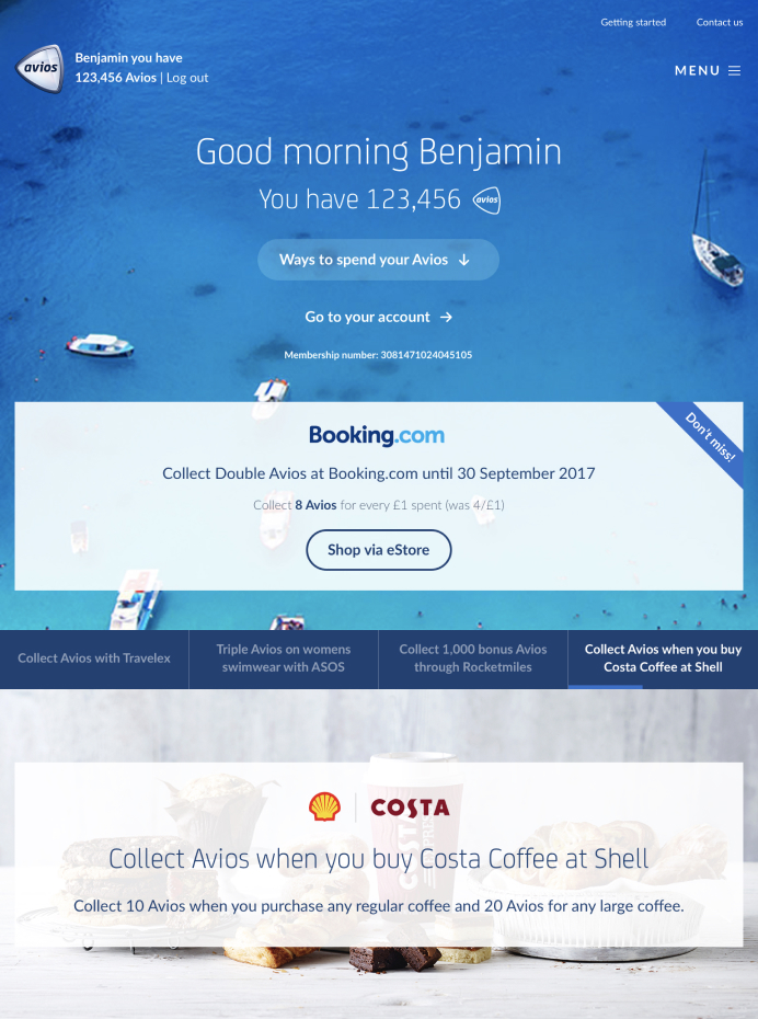
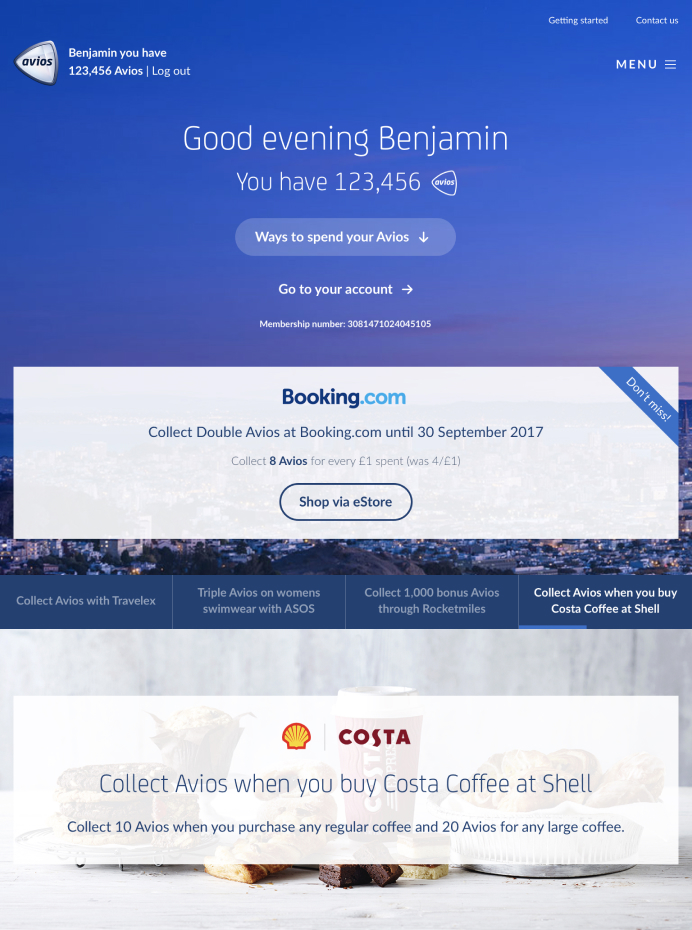
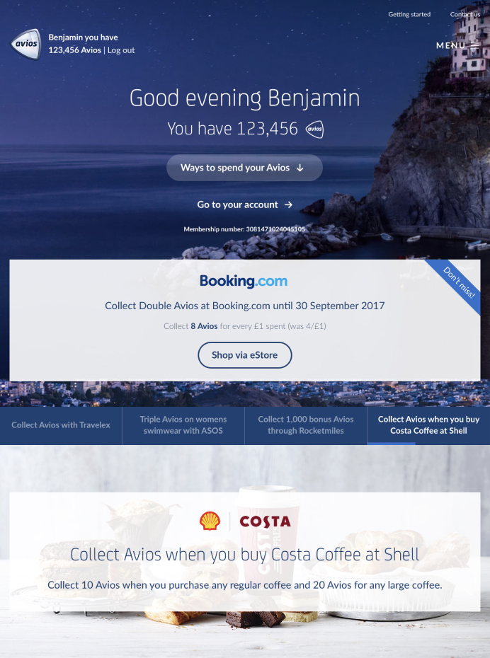
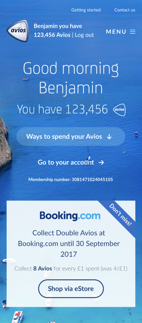
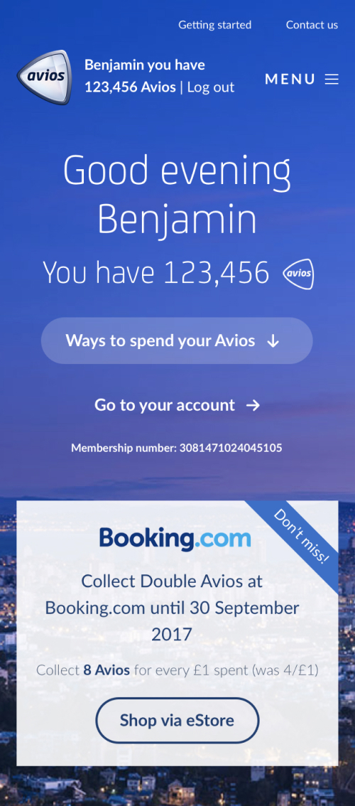
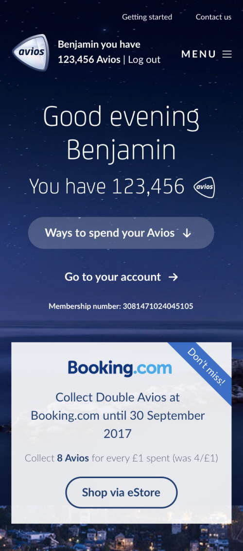
To give Avios members a warm and inspiring welcome to the website, we introduced a hero banner to the top of the homepage that greets you with a message and destination background relevant to your local time of day.
For logged-in members, we go on to introduce personal account information - such as balance, membership number and balanced based redemption opportunities.
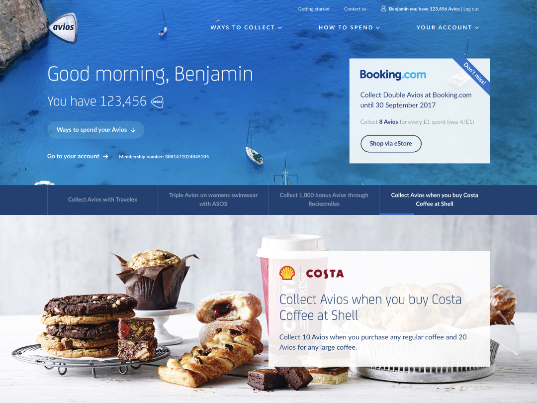
Logged-in daytime greeting
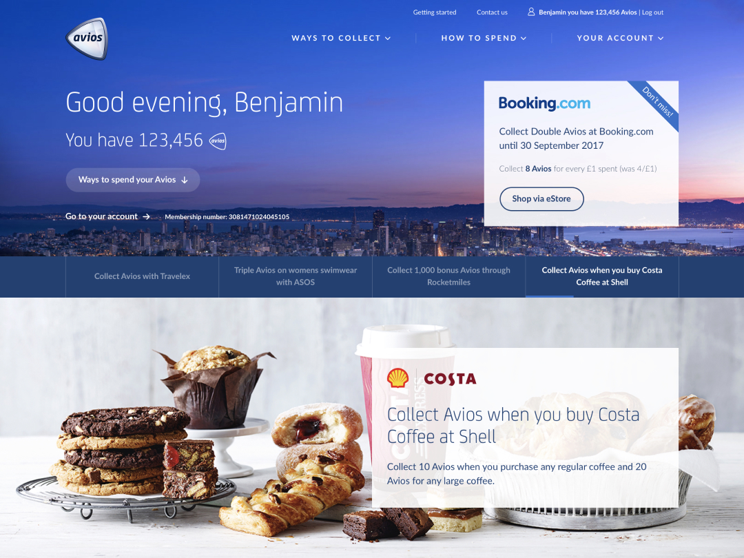
Logged-in early evening greeting
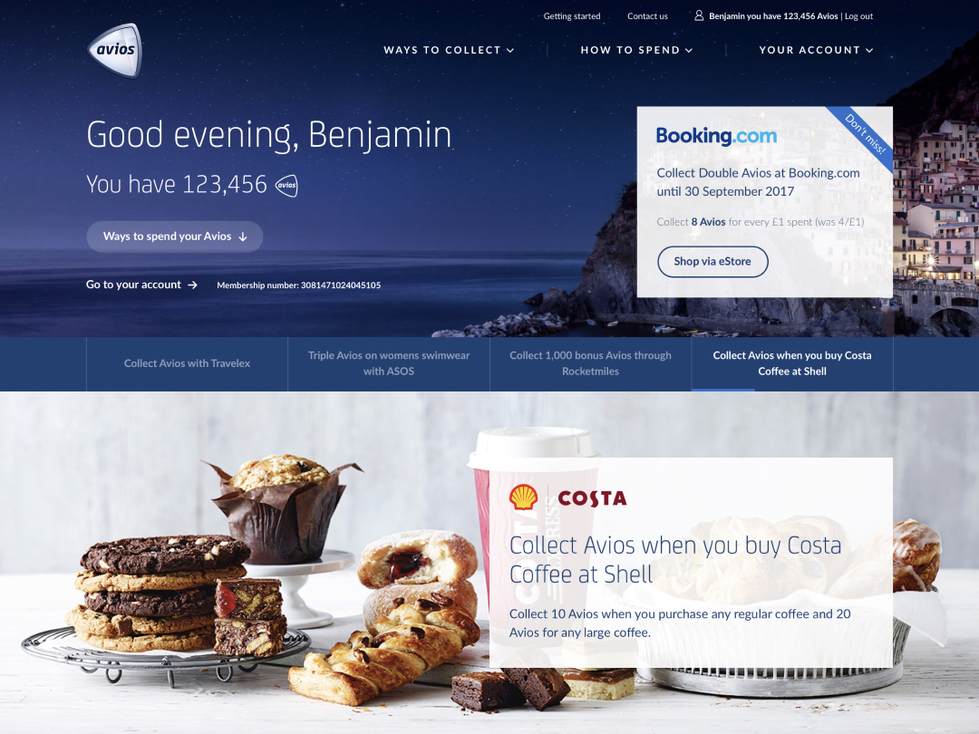
Logged-in late evening/night greeting
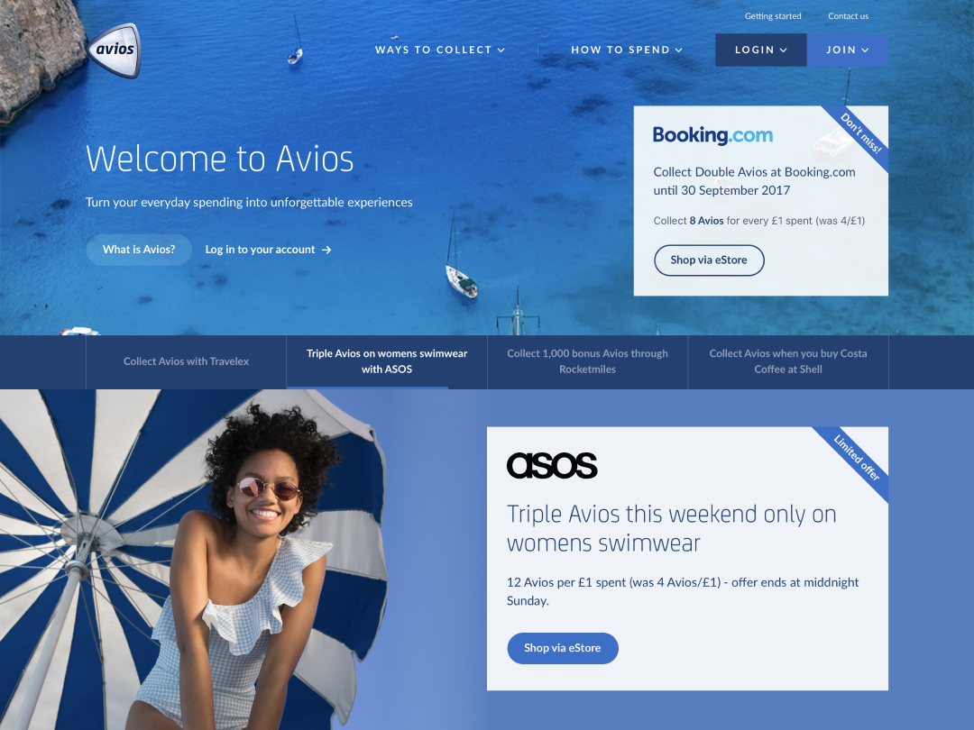
Logged-out daytime greeting
Logged-in daytime greeting
Logged-in early evening greeting
Logged-in late evening/night greeting
Logged-in daytime greeting
Logged-in early evening greeting
Logged-in late evening/night greeting
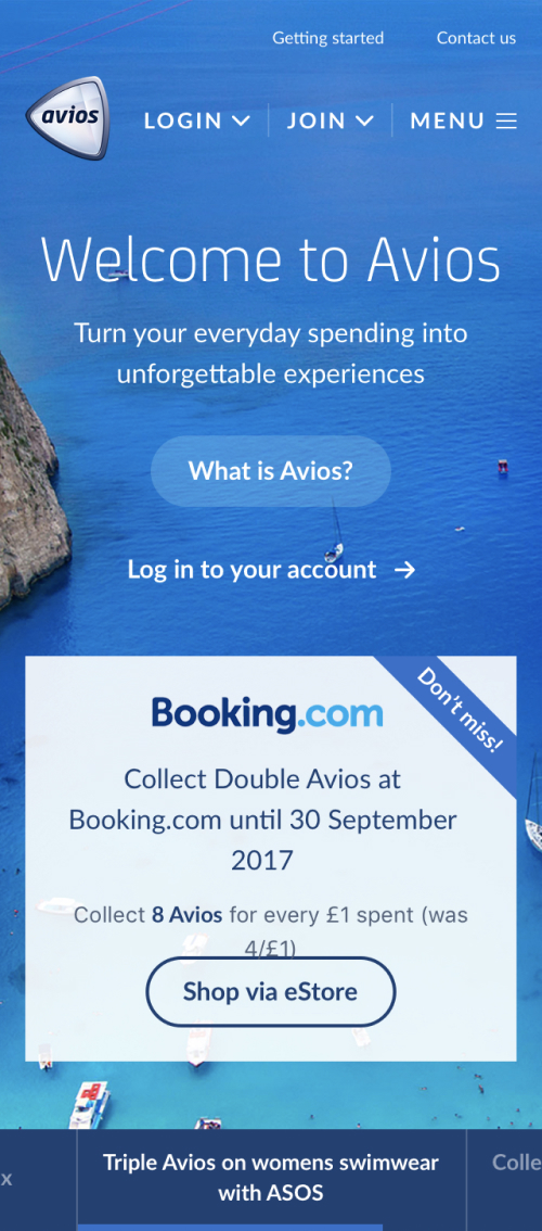
Logged-out daytime greeting
Content building blocks
I worked closely with the Content Squad to create a variety of modules for use with our new CMS. The goal was to create consistency across pages, optimise usability and simplify creating content with the use of scalable modules.
To ensure they behaved just as intended, I created content guidelines for quick reference to character limits, asset sizes/formats, etc – for use by internal and external contributors.
We also ran an ABC test with the new modules which concluded with an 8% uplift in users clicking out to direct partner channels. The third variant was an agency designed version of the modules, which saw a 26% drop in click outs and increased bounce rate…
Partner intro
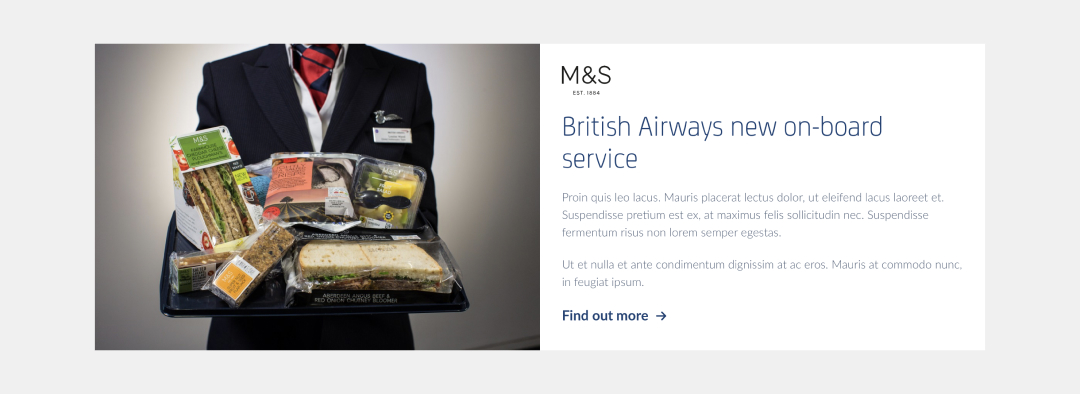
Featured content card
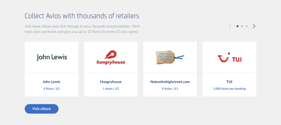
Collection partner carousel
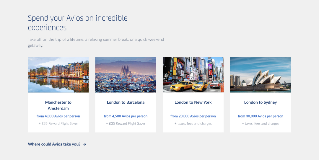
Redemption opportunities
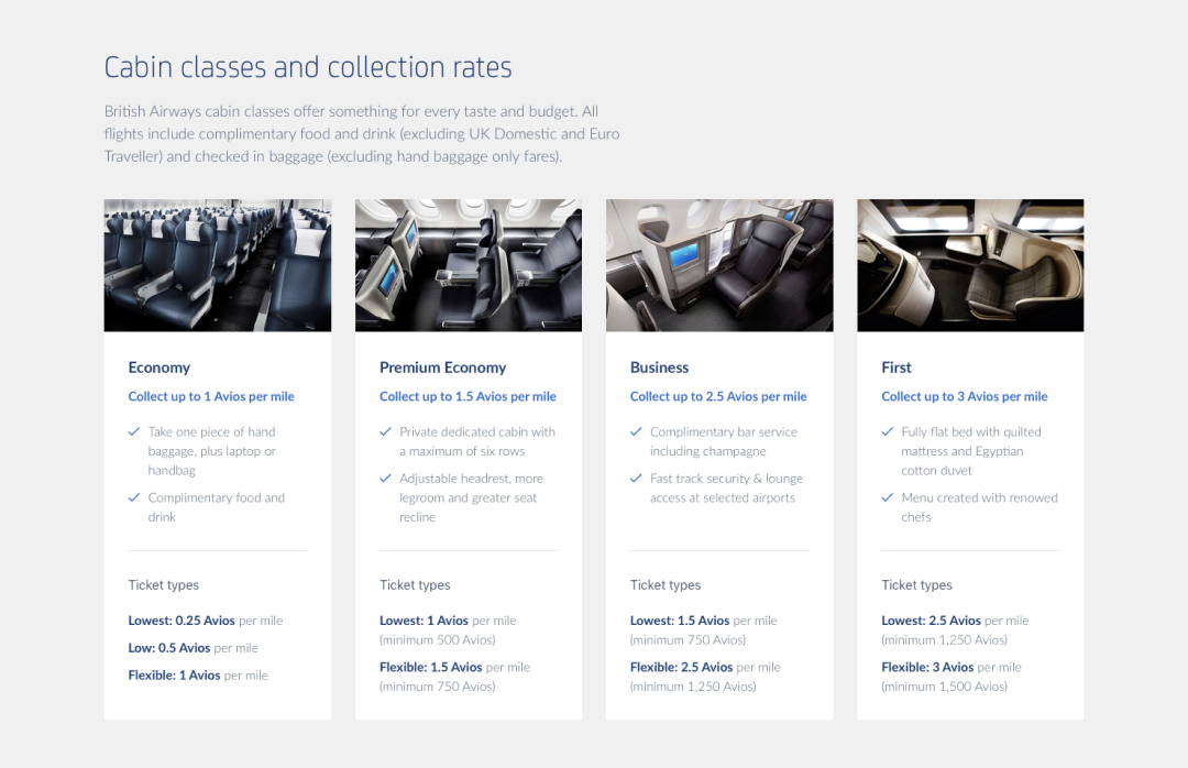
Comparison cards
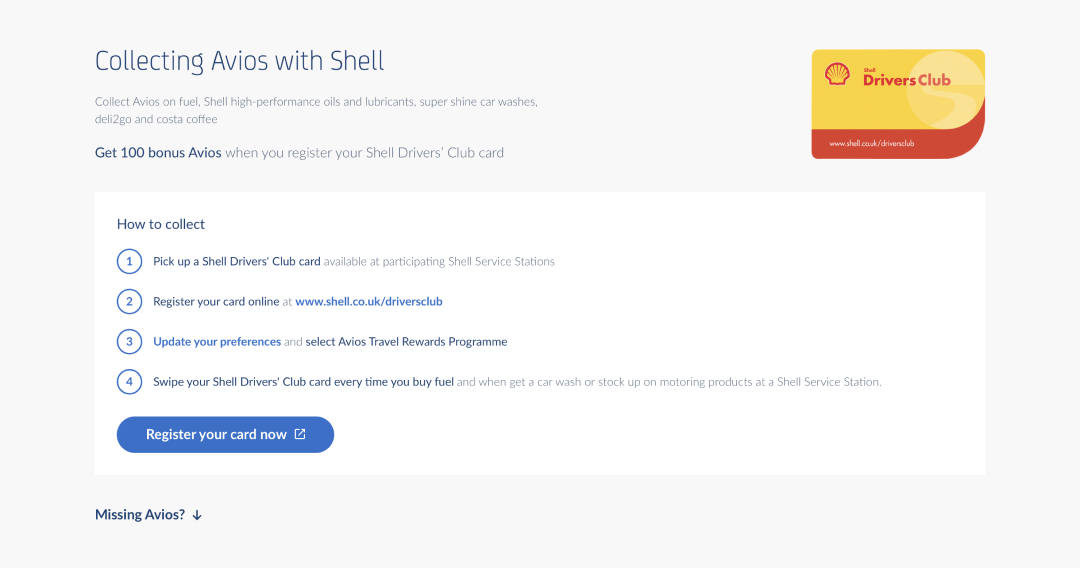
How to collect steps
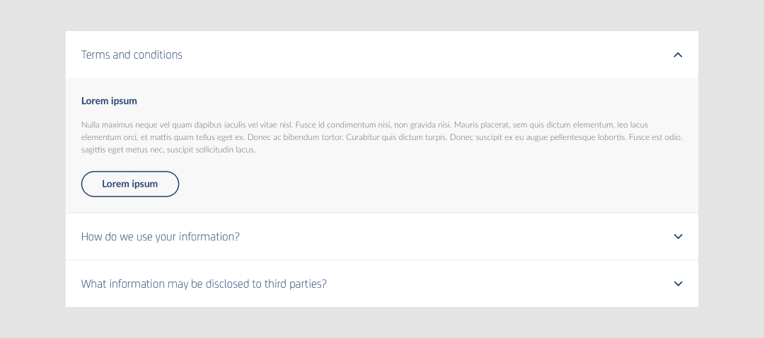
Accordion content

Sticky CTA
Refreshed redemption
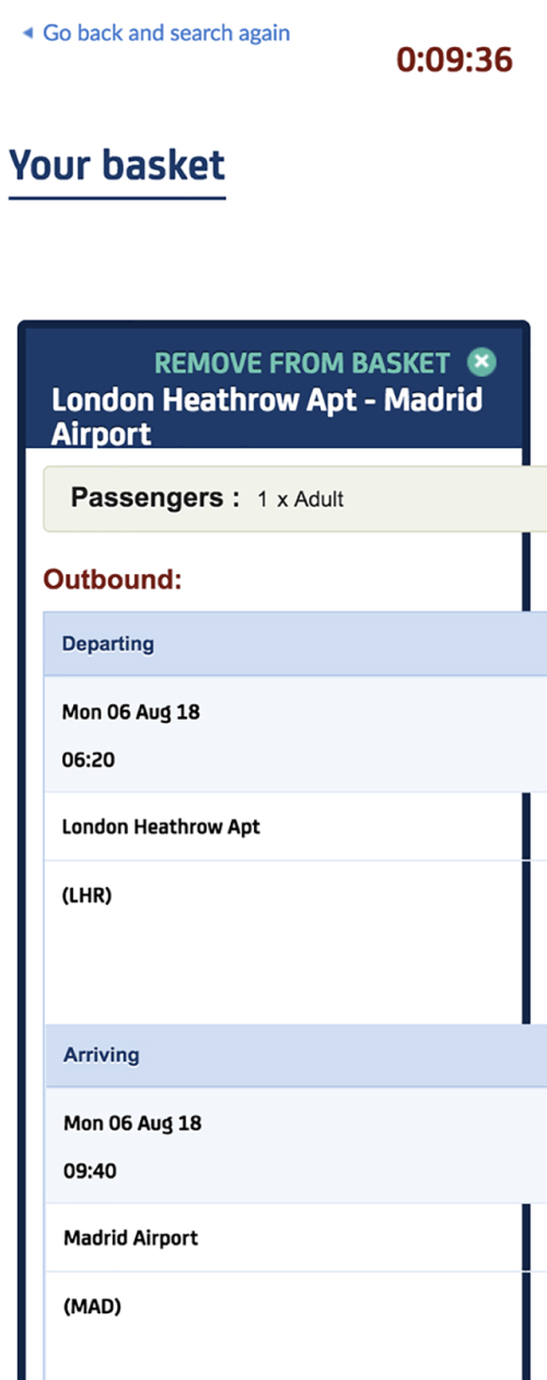
Flight search results, basket and checkout were always considered no man’s land due to the complex database integration and the risks involved in making even the smallest change. The journey wasn't responsive, didn't meet accessibility standards and was being replaced by a third party service on mobile and tablet - this had to change.
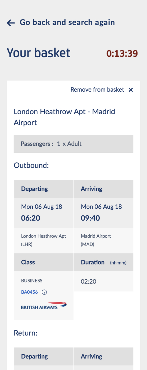
Using just CSS I was able to completely transform the page to introduce WCAG AA standard accessibility, responsive layout and apply our new design language. This was a huge win for us and the user, as well as a huge cost saving for Avios.
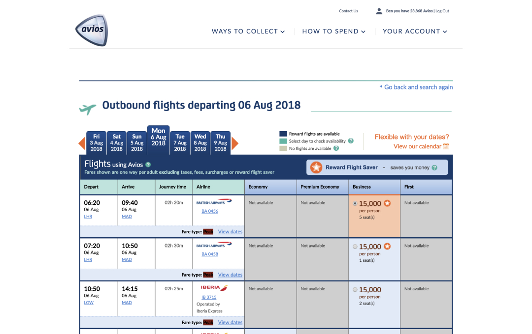
Flight results – before
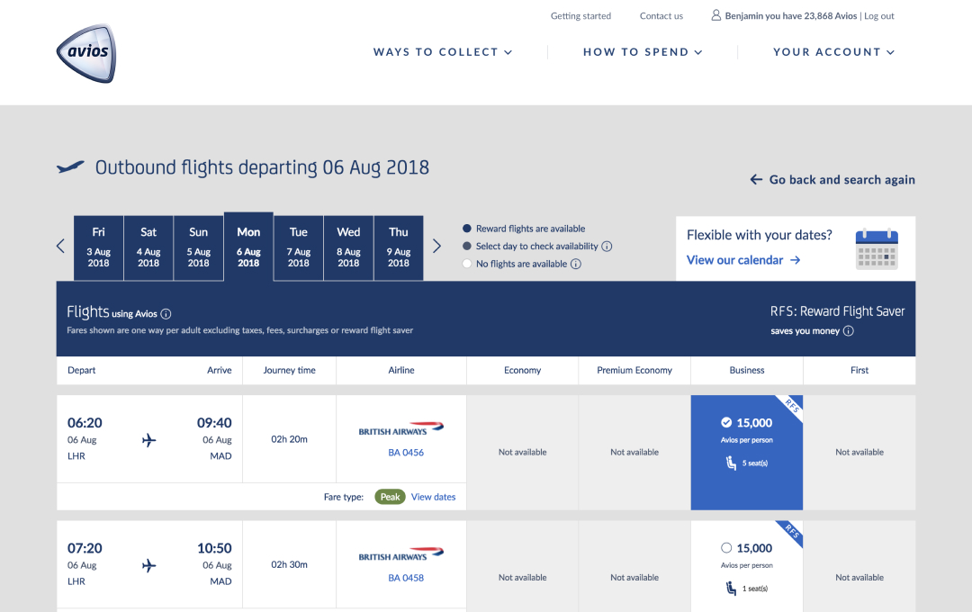
Flight results – after
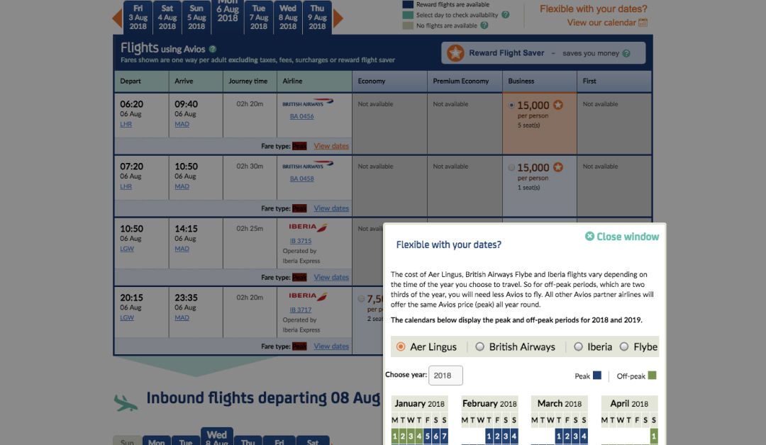
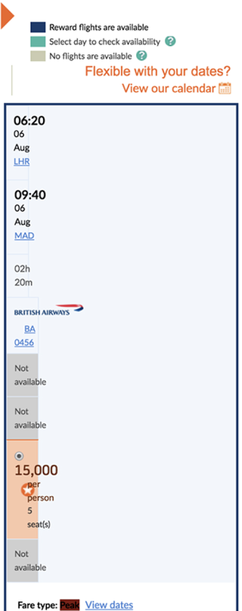
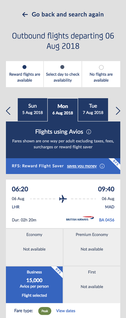
Availability calendar – before
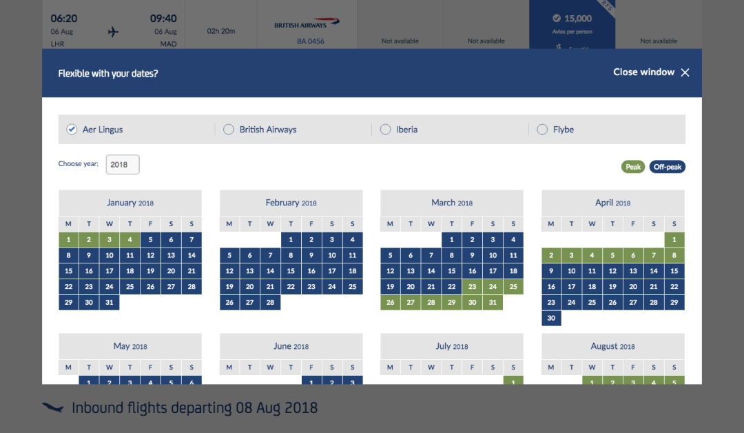
Availability calendar – after
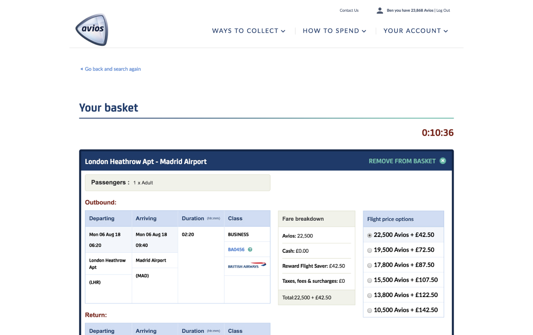
Basket – before
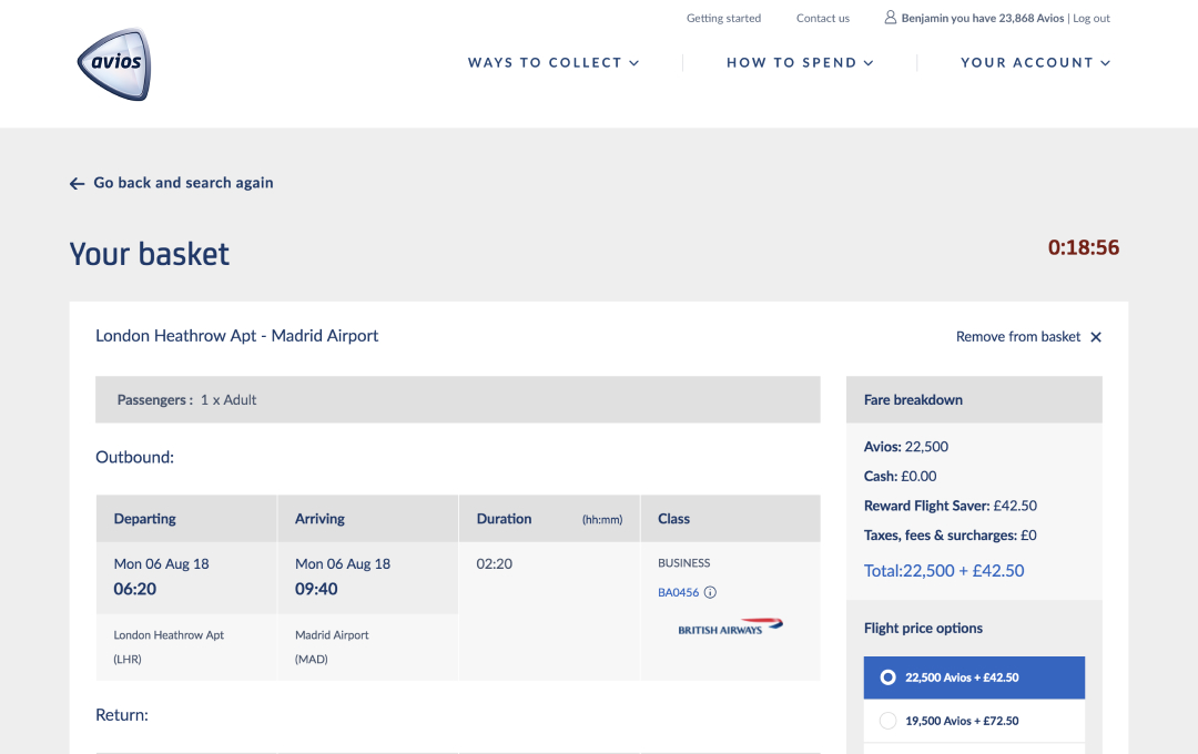
Basket – after
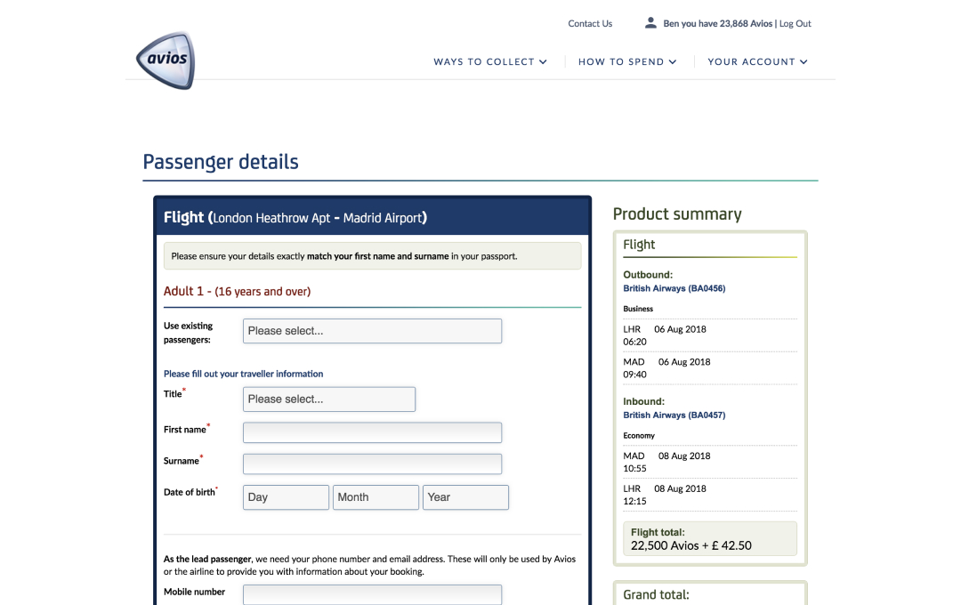
Passenger details – before
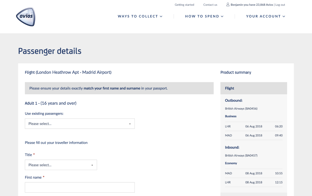
Passenger details – after
Flight results – before
Flight results – after
Basket – before
Basket – after
Partner checkout API
We designed a lightweight widget that could be embedded into any retailer’s checkout journey, regardless of width and layout. Its neutral tones and appearance ensures visual harmony with both the retailer and associated frequent flyer programmes individual brand.
Check out the mobile prototype
Initial state
Account login
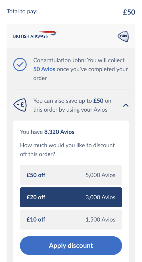
Discount options
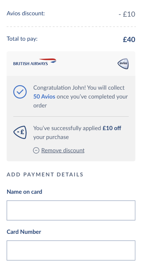
Discount applied
More coming soon...
This page is a working progress and will be updated with more work soon.